Interface design has undergone a fundamental transformation over the past decade. The traditional workflow — a single designer working in a desktop application, exporting static files, emailing them to stakeholders for feedback, incorporating revisions, and repeating the cycle — has given way to collaborative, browser-based design environments where multiple designers work simultaneously on the same file while developers inspect design specifications in real-time. Figma has been the primary catalyst for this transformation, building a design tool from the ground up for cloud-native collaboration and redefining how design teams create, iterate, and deliver digital product interfaces.
Since its launch in 2016, Figma has grown from an ambitious browser-based design experiment to the dominant interface design platform used by product teams at organizations of every scale. Its combination of professional-grade design capabilities, real-time multiplayer collaboration, and browser-based accessibility has attracted designers, product managers, engineers, and stakeholders into a shared design environment that previous desktop-only tools could not provide. Understanding Figma’s capabilities, workflow implications, and limitations helps organizations evaluate whether this platform aligns with their design team’s needs and collaboration requirements.
Core Design Capabilities
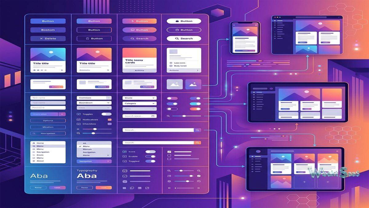
Figma provides a vector-based design environment with tools for creating user interface layouts, icons, illustrations, and visual assets. The canvas-based workspace supports multiple pages within a single file, allowing designers to organize different screens, states, and explorations within a unified project structure. Design tools include shape creation, pen tool for custom paths, text formatting with Google Fonts integration, image manipulation, masking, blending modes, and effects including shadows, blurs, and background fills.
Auto Layout is one of Figma’s most powerful features, providing responsive design behavior within frames. Auto Layout frames automatically resize and reposition their children based on configurable rules — padding, spacing, alignment, and distribution — mimicking the behavior of CSS flexbox and enabling designers to create components that adapt to varying content lengths. A button component with Auto Layout automatically adjusts its width when the label text changes. A card component resizes its height when description text wraps to additional lines. This responsive behavior eliminates the manual resizing that consumes significant design time in tools without comparable layout automation.
Components and Variants provide a systematic approach to design element management. A component defines a reusable design element — a button, an input field, a navigation bar, a card — that can be instantiated throughout the design file. Changes to the main component automatically propagate to all instances, maintaining consistency across hundreds of screens. Variants extend components with multiple states — a button component might include variants for primary, secondary, disabled, hover, and loading states — organized within a single component set rather than separate unrelated elements.
Component properties allow customization of instances without detaching them from the main component. Boolean properties toggle visibility of nested elements. Text properties expose editable text layers. Instance swap properties allow selecting different nested components. These properties enable designers to configure component instances for specific contexts while maintaining their connection to the design system, reducing the need for one-off detached copies that drift from established patterns over time.
Real-Time Collaboration
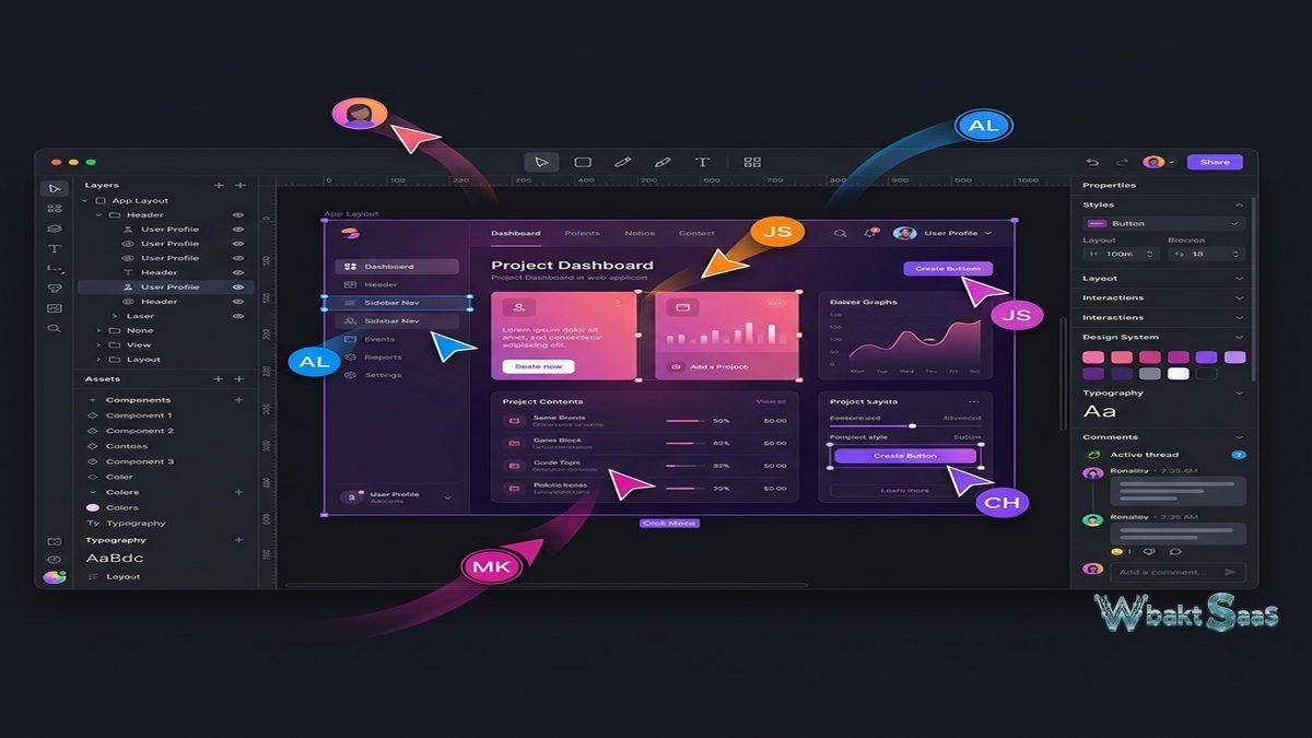
Figma’s real-time collaboration capabilities define its core competitive advantage. Multiple designers can work on the same file simultaneously, with each person’s cursor, selection, and edits visible to all other collaborators in real-time. This multiplayer design experience eliminates the file version conflicts, manual merging, and “who has the latest version?” confusion that plagued design teams using traditional desktop tools with file-based storage.
Observation mode allows stakeholders to follow a specific designer’s viewport, seeing exactly what they see as they navigate and work through the design. This feature is particularly valuable during design reviews and presentations where the presenter wants all viewers to see the same context without manually synchronizing navigation. Conversely, each collaborator can independently navigate the file, zooming into different areas and reviewing different screens without affecting other users’ views.
Commenting enables asynchronous feedback directly on the design canvas. Reviewers click on specific locations to leave contextual comments that remain anchored to their placement, even as the design changes around them. Comment threads support discussion, resolution marking, and @mentions that notify specific team members. For distributed teams where synchronous review sessions are difficult to schedule, comments provide a structured feedback mechanism that keeps design critique connected to the visual elements being discussed.
Branching and merging (available on higher-tier plans) allow designers to create branches of a design file for exploration or iteration without affecting the main file. Once the branch work is approved, changes merge back into the main file. This workflow parallels software development’s branching model and serves design teams that need to explore alternatives or work on features in parallel without risking the stability of the primary design file.
Prototyping
Figma’s built-in prototyping tools connect static design frames into interactive flows that simulate the user experience of navigating through an application or website. Prototype connections link elements on one frame to destination frames, creating clickable navigation paths. Transition animations — dissolve, slide, push, move — control how frames transition when users interact with prototype triggers.
Smart Animate interpolates visual differences between frames, creating smooth animations for interface state changes — menus opening, cards expanding, elements repositioning — without requiring frame-by-frame animation definition. Designers define the start and end states, and Smart Animate generates the transition between them. This capability enables prototypes that communicate motion design intent alongside layout and visual design, giving stakeholders and developers a more accurate preview of the intended user experience.
Interactive components enable prototyping of component-level interactions — toggles switching between on and off states, dropdown menus opening and closing, tabs switching between content panels — within component definitions that work consistently throughout the prototype. This eliminates the need to create separate frames for every state change, dramatically reducing the number of frames required for comprehensive prototyping and making prototypes easier to maintain as designs evolve.
Prototype sharing generates shareable links that allow stakeholders to interact with prototypes in their web browser without Figma accounts or installed software. Prototype viewers click through the designed flows, experiencing the interaction design as a user would experience the final product. This frictionless sharing enables rapid feedback collection from users, clients, and decision-makers who may not be familiar with design tools.
Design Systems and Libraries
Figma supports organizational design systems through team and organization libraries. Components, styles (colors, typography, effects, grids), and variables published to a team library become available across all team files. When a designer needs a button, they pull it from the team library rather than recreating it or copying from another file. When the design system team updates the button component in the library, every file using that button receives an update notification and can pull the latest version.
Design tokens through variables define reusable values for colors, spacing, sizing, border radius, and opacity that can be systematically applied across components and designs. Variable modes enable theme switching — light mode and dark mode color schemes defined as variable modes apply automatically across the entire design when switched, eliminating the manual color-swapping work that previously required separate design files for each theme.
Style documentation within Figma files or through plugins helps design teams communicate usage guidelines, component specifications, and design patterns to designers and developers who consume the design system. Well-maintained Figma design systems serve as living documentation that stays synchronized with the actual design components, unlike static design documentation that quickly becomes outdated as the design system evolves.
Dev Mode and Developer Handoff
Dev Mode provides a developer-focused interface for inspecting design files. Developers access precise measurements, CSS code snippets, color values, typography specifications, and asset export settings directly from Figma without requiring designers to prepare separate specification documents. The inspect interface adapts to developer preferences, showing values in pixels, rems, or percentages and generating code snippets for CSS, iOS (Swift), and Android (XML).
Ready for development markers allow designers to flag specific frames as finalized and implementation-ready, creating a clear handoff signal in the design-to-development workflow. Developers can filter to see only flagged frames, focusing their attention on designs that have completed the review process rather than exploring work-in-progress explorations.
Plugin integrations connect Figma’s design data with development tools. Storybook plugins synchronize Figma components with their coded counterparts. Token export plugins generate design token files in formats consumable by development build systems. Measurement and annotation plugins add additional specification details that the built-in inspect panel may not cover for specific development workflows.
FigJam
FigJam is Figma’s collaborative whiteboard tool, providing an infinite canvas for brainstorming, diagramming, planning, and workshop facilitation. While not a design tool itself, FigJam complements the Figma design workflow by providing a space for the ideation and planning activities that precede detailed design work. Sticky notes, shapes, connectors, stamps, drawing tools, and embedded media enable visual collaboration during workshops, retrospectives, user journey mapping, and strategic planning sessions.
FigJam’s integration with Figma allows assets and content to flow between the whiteboard and design environments. Design frames can be embedded in FigJam for contextual discussion, and FigJam content can inform design decisions in Figma files. This integration positions the Figma platform as a comprehensive creative workspace spanning ideation through detailed design and developer handoff.
Integrations and Plugins
The Figma plugin ecosystem extends the platform’s capabilities through community-developed and commercial plugins. Popular plugin categories include content generation (placeholder text and images), accessibility checking (contrast ratio validation, screen reader simulation), icon libraries, stock photography integration, animation export, and design system documentation. The plugin API enables organizations to build custom plugins that connect Figma with their proprietary tools and workflows.
REST API access enables programmatic interaction with Figma files — extracting design data, generating assets, updating variables, and integrating design information with external systems. Design-to-code platforms use the Figma API to generate production code from design files, and design system documentation platforms use it to keep documentation synchronized with design components.
Accessibility in Design
Figma supports accessibility-conscious design through built-in and plugin-based tools. Contrast ratio checking validates that text and background color combinations meet WCAG accessibility standards, helping designers identify and fix readability issues during the design phase rather than after development. Color blindness simulation plugins show how designs appear to users with various forms of color vision deficiency, enabling designers to verify that color-dependent information remains accessible to all users.
Annotation plugins allow designers to add accessibility specifications to their designs — alternative text descriptions for images, heading hierarchy indicators, focus order annotations, and ARIA role specifications — creating documentation that developers need to implement accessible interfaces. These annotations bridge the gap between visual design and the invisible markup that screen readers and assistive technologies require.
Community and Resources
The Figma Community provides a public repository of design files, plugins, and widgets shared by designers worldwide. Community files include UI kits, design system starters, icon libraries, wireframe templates, and complete application design examples that designers can duplicate and customize for their own projects. This open sharing ecosystem accelerates design work by providing starting points that eliminate the need to build common design elements from scratch.
Educational resources including Figma’s official documentation, video tutorials, interactive lessons, and community-created courses support designers at all skill levels. The platform’s widespread adoption means that design education programs, bootcamps, and university courses increasingly teach Figma as the primary interface design tool, creating a growing pool of designers with Figma proficiency.
Mobile Design and Responsive Workflows
Figma supports mobile app design through device-specific frame presets for iOS and Android screen sizes, platform-specific component libraries, and prototype viewing on mobile devices through the Figma Mirror app. Designers can view their prototypes on actual mobile devices during the design process, validating touch target sizes, text readability, and visual hierarchy on the screens where users will ultimately interact with the final product.
Responsive design workflows use Auto Layout and constraints to create designs that adapt across screen sizes. A single component can be configured to reflow its layout from desktop to mobile proportions, demonstrating responsive behavior within the design tool rather than leaving responsive implementation entirely to developers. This capability is particularly valuable for design systems that need to serve applications across desktop, tablet, and mobile form factors.
Common Use Cases
Product Design: Product design teams use Figma as their primary workspace for creating user interfaces, interaction flows, and visual designs for web and mobile applications. The collaborative environment enables designers, product managers, and engineers to work within the same file context.
Design System Management: Organizations build and maintain their design systems in Figma, using libraries to distribute components, styles, and tokens across design teams. The centralized library model ensures consistency across products and teams while allowing individual designers to customize instances for specific contexts.
User Research and Testing: Interactive prototypes created in Figma serve as test stimuli for usability testing, allowing researchers to observe how users interact with proposed designs before development begins. This research integration reduces the cost of design validation by catching usability issues during the design phase.
Marketing and Brand Design: Marketing teams use Figma for social media graphics, presentation designs, email templates, and brand asset creation. The collaborative commenting and approval workflow serves marketing review processes where multiple stakeholders provide feedback on visual content before publication.
Pricing
Figma offers a free tier for individual designers with limited project and file capacity. Professional, Organization, and Enterprise plans unlock team features, shared libraries, branching, Dev Mode, administrative controls, and increased capacity. The per-editor pricing model means that only team members who edit designs require paid seats — viewers, commenters, and developers using Dev Mode may access files at different pricing levels depending on the specific plan.
Pricing and features are subject to change. Please verify current plan details on the official Figma website before making purchasing decisions.
Limitations
- Internet dependency: As a browser-based tool, Figma requires internet connectivity for full functionality. Offline access is limited, and performance depends on network quality.
- Complex file performance: Very large files with hundreds of frames, thousands of components, and extensive prototyping connections can experience performance degradation in browsers.
- Advanced illustration limitations: While Figma handles interface design capably, it lacks some advanced illustration features (mesh gradients, perspective grids, advanced path operations) that dedicated illustration tools like Adobe Illustrator provide.
- Print design gaps: Figma is optimized for screen design. Print-specific features including CMYK color modes, bleed margins, and print-resolution output are not available.
- Learning curve for design systems: Building and maintaining effective design systems with components, variants, properties, and variables requires significant investment in architecture and documentation.
Summary
Figma has redefined interface design tooling by proving that professional design capabilities and real-time collaboration can coexist in a browser-based platform. Its combination of powerful design tools, multiplayer collaboration, comprehensive prototyping, design system infrastructure, and developer handoff capabilities creates a complete workflow from ideation through implementation that previous generation tools achieved only through multiple disconnected applications.
Design tools including Figma, Sketch, Adobe XD, Penpot, and Framer each serve the interface design market with different strengths. Figma’s advantages center on collaboration depth, cross-platform accessibility, and ecosystem breadth. Organizations evaluating design tools should consider their team’s collaboration patterns, platform requirements, design system maturity, and integration needs when selecting the tool that best supports their design workflow.
Features, pricing, and availability discussed in this review reflect information available at the time of writing. Software products evolve continuously, and details may have changed since publication. Please verify current information directly on the official Figma website. WBAKT SaaS is an independent review platform with no affiliate relationships with any software company mentioned in this article.
For related collaboration tools, see our reviews of Miro digital whiteboard, Notion vs Coda workspace platforms, and Slack team communication.
About the Author
